Siesa.
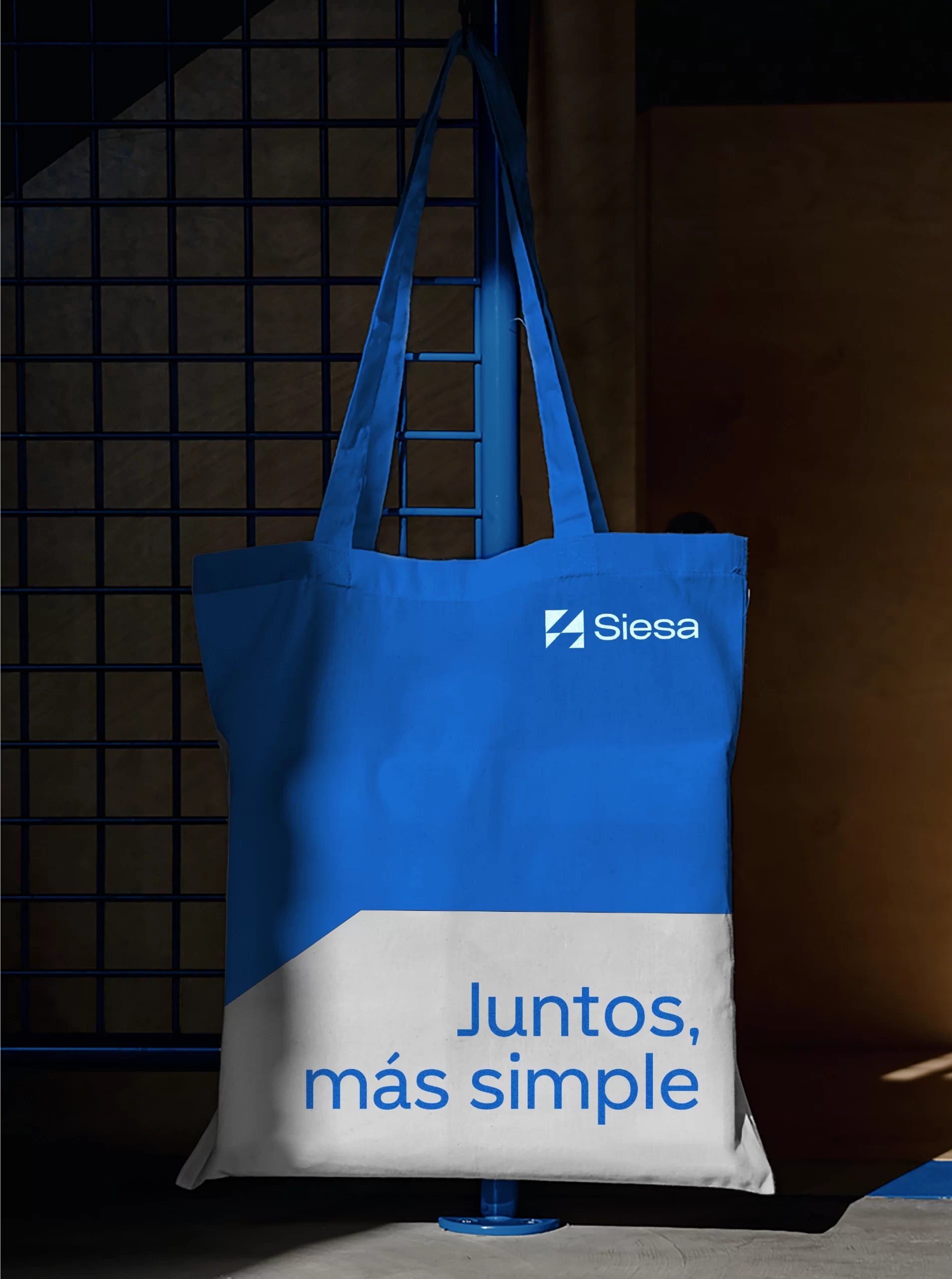
Simpler together.
BRAND STRATEGY
BRAND ARCHITECTURE
BRAND IDENTITY
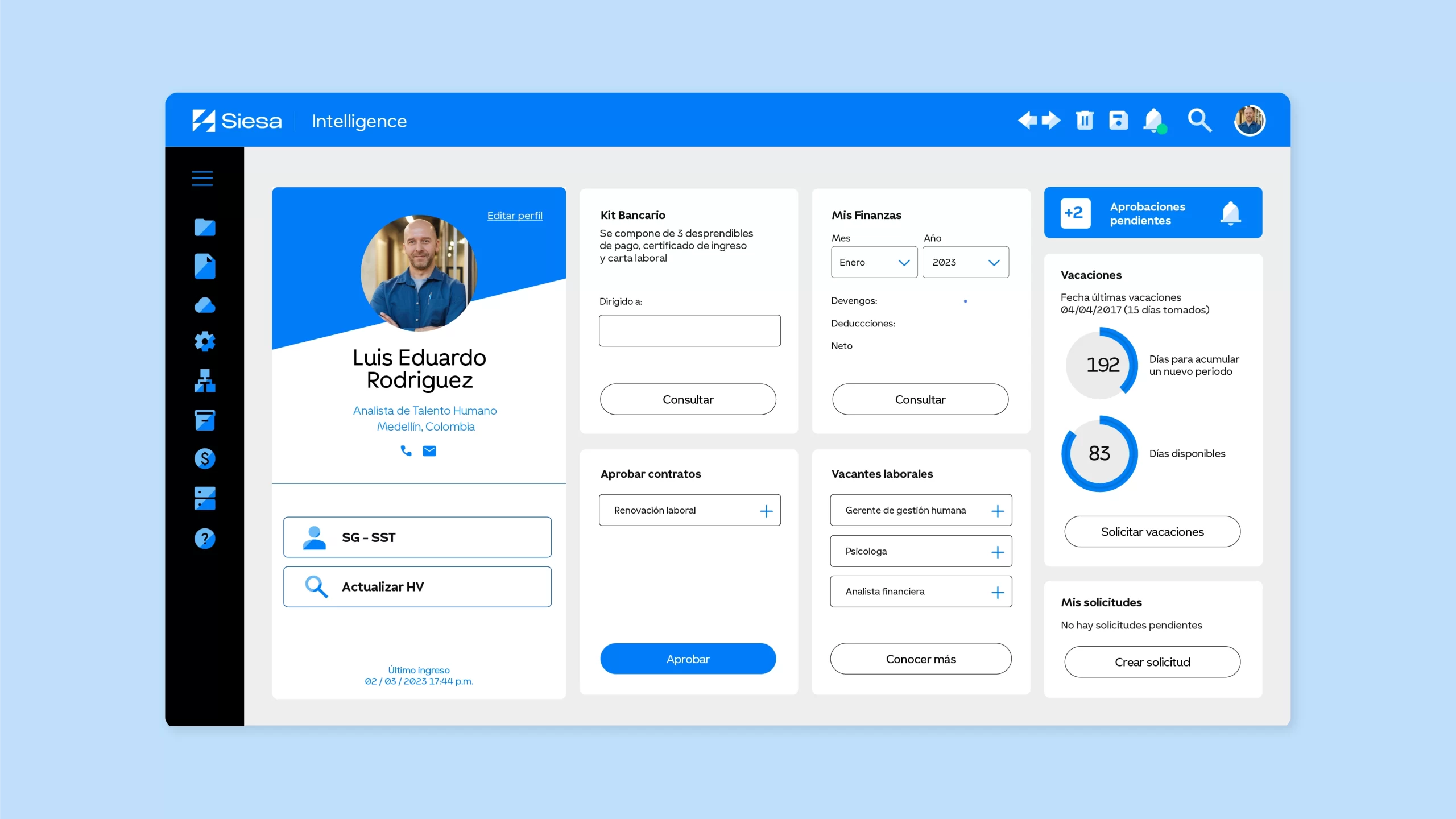
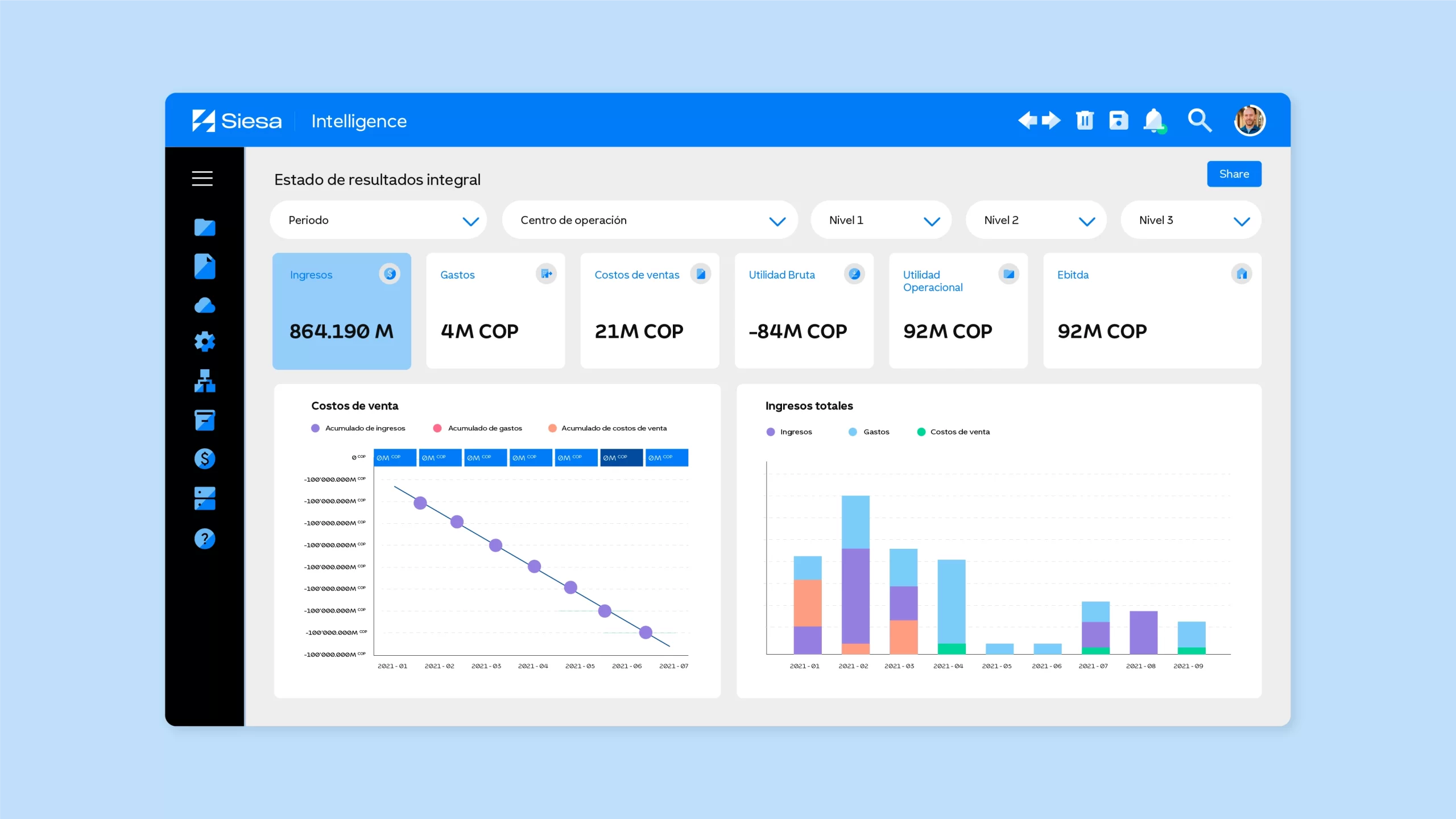
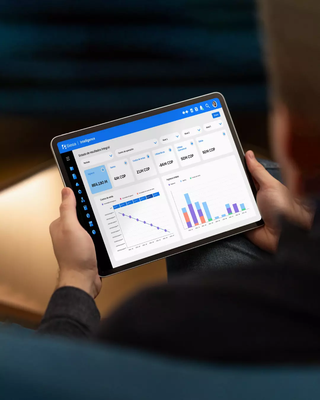
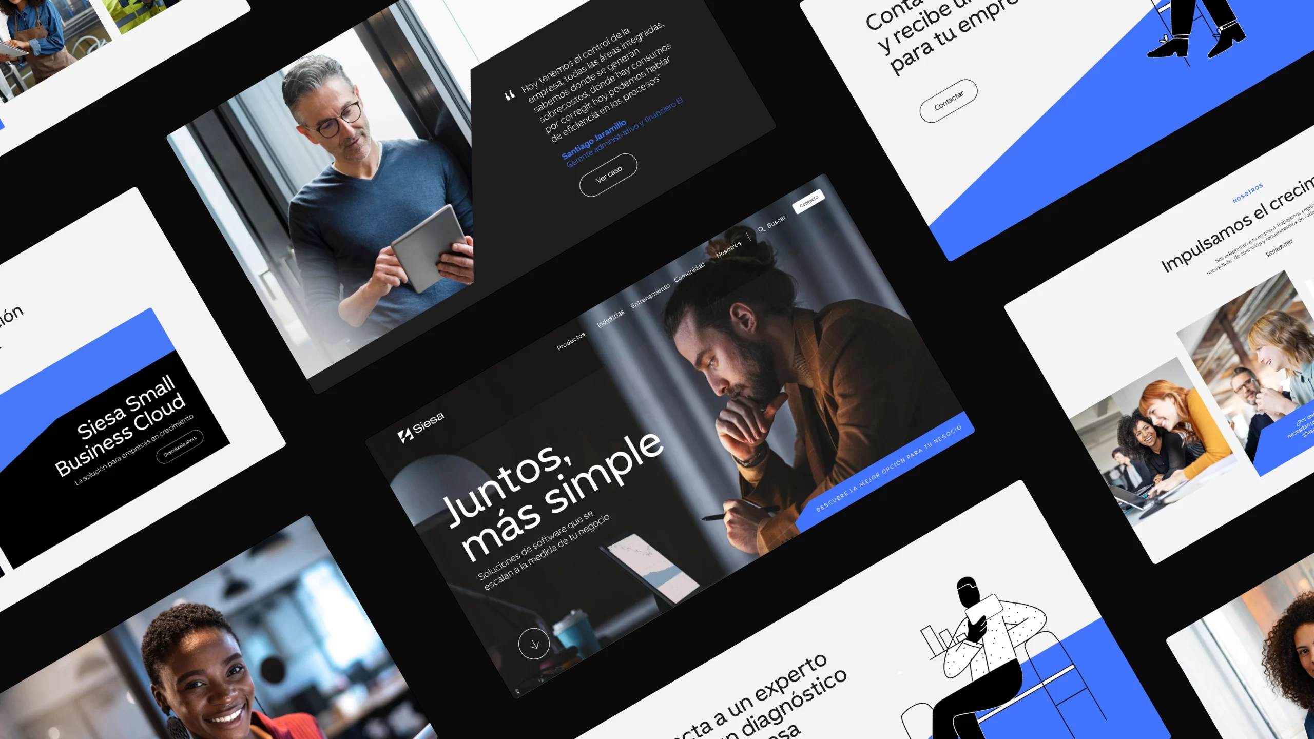
Siesa specializes in ERP software solutions for businesses, boasting a clientele of over 10,000 across Latin America. With a firm foothold in the region, they embarked on an ambitious expansion into the United States and Europe, prompting a comprehensive reevaluation of their brand strategy and positioning.
A symbol to keep growing
We have crafted a distinctive symbol from an abstract ‘S,’ using projections that reflect Siesa’s commitment to business growth. The diversity of projections captures the essence of their offering: as a company expands, additional models are integrated into its ERP to continue expanding. In its simplicity, the symbol reflects Siesa’s aspiration to maintain straightforward relationships with its clients, growing together.

A system with projection
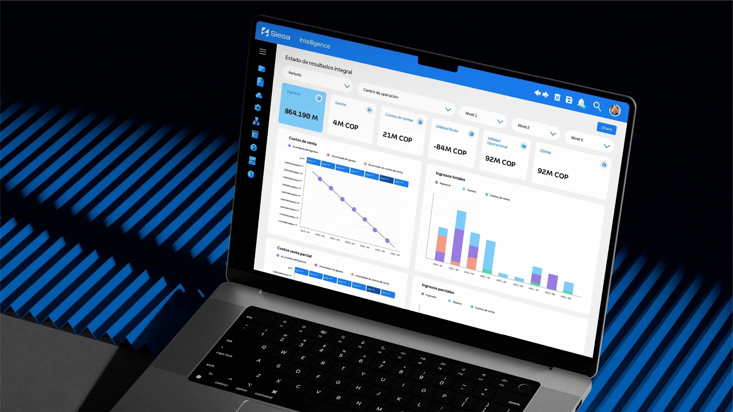
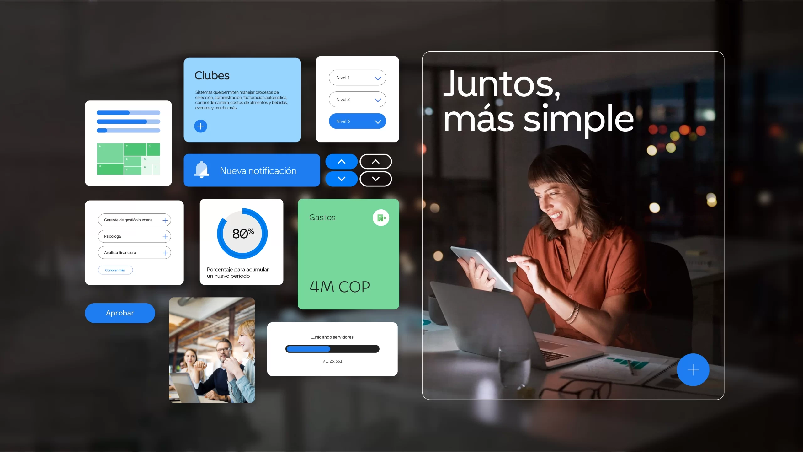
More than just being a functional layout system, we created a system with its own narrative, based on the concept of “Projection.” Siesa accompanies the growth of its clients, and this philosophy is reflected throughout the system, always projecting itself upwards and forwards. These projections can be seen at all scales according to the spaces and formats, becoming a versatile system that ensures a coherent and consistent presence in all the spaces it occupies.
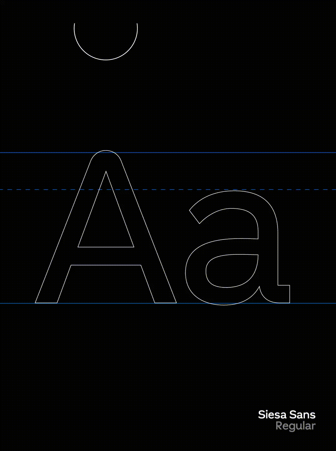
Typography
In our quest to speak the same technological language, we developed a custom-made typeface by Bastarda Type. This typography reflects Siesa’s two worlds: its technological foundation is derived from monospaced fonts, but it is balanced with curves that emphasize Siesa’s closeness to its clients to support their growth.

Color
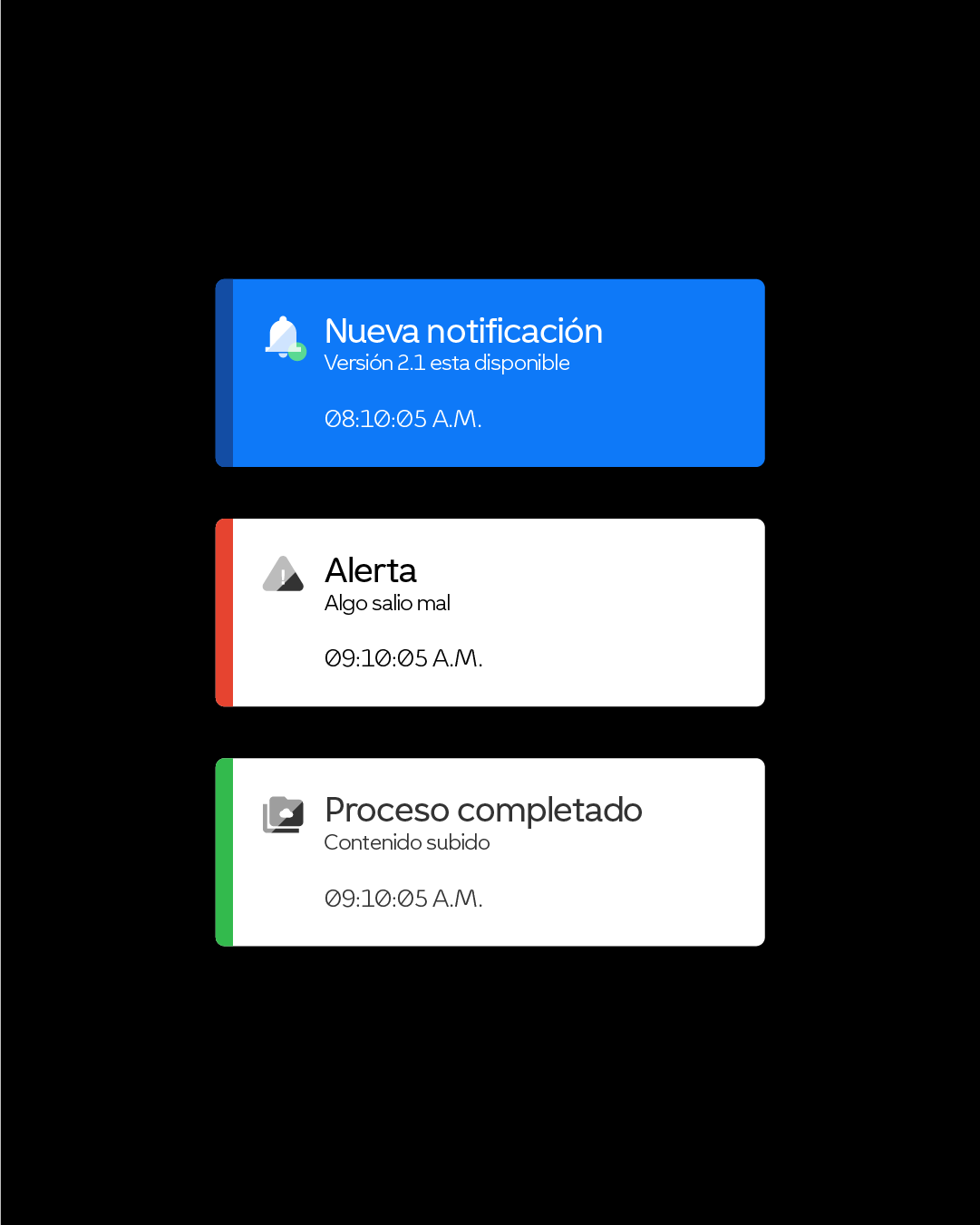
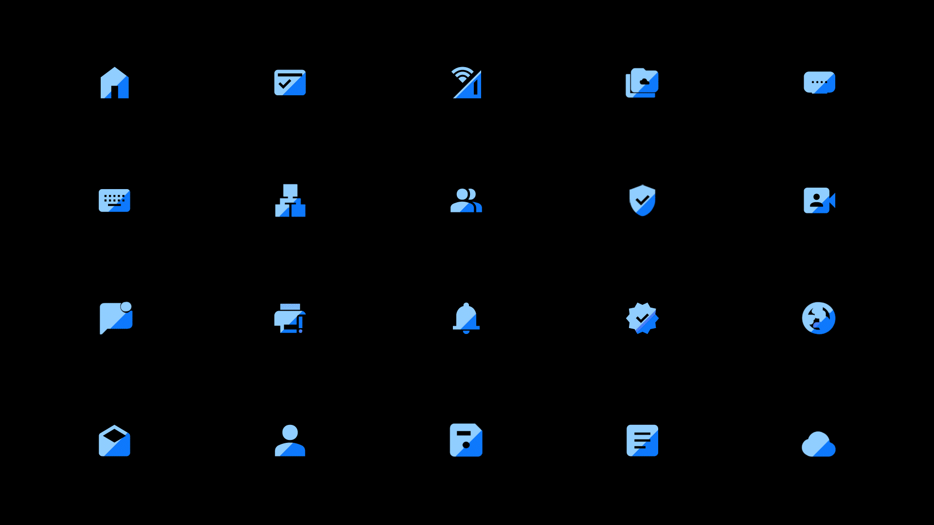
We preserve the blue as a legacy of the brand, now reinterpreted in the technological language. This palette extends towards a variety of vibrant colors on different scales, adapting in a versatile way to the demands of interfaces and digital products.